


In a world of complexity, work is unpredictable. Stakeholders want predictability and want to know when it will be done. Jahanger Hussain explores metrics and practices to answer this question in an agile context.
Moneyball is a quest for the secret of success in baseball, how to win in the Major Leagues with a budget that’s smaller than that of nearly every other team. It is the story of the Oakland A’s baseball team.
One of the key messages from the story that sticks out is an idea I want to focus on in this article. In our product world, product owners and business stakeholders are always asking ‘when will it be done?’. To answer this with a good degree of predictability, we need to have measures and data in place. However, many organisations end up measuring the ‘wrong things’ to answer this question.
In the book Moneyball, the idea of measuring the right things is alluded to. In short Billy Beane, the General Manager of the Oakland A’s baseball team, took a radically different and more data-driven approach to running a professional baseball club in the early 2000s.
The results they produced debunked the widely held view that the poorer clubs would never be able to compete with the rich clubs like the New York Yankees, who had a player payroll budget roughly three times that of the Oakland A’s. Poorer clubs like The Oakland A’s paid about half a million dollars per win, whereas the richer teams were paying nearly $3m.
Traditional scouts from across different teams would come together and test a group of elite amateur prospects to determine who they should select in the draft that year. These scouts had a checklist of abilities that were required for a player to be judged worthy of a draft. This checklist was their supposed recipe for success and included abilities such as:
- Running
- Throwing
- Fielding
- Hitting
- Hit power
Of course, they did not just look at the checklist, they also looked for talent and whether the player had a ‘good face’. Some scouts believed they could tell a player’s character and their future in pro-ball just by the structure of their face.
This checklist gained more importance as the average big-league salary had tripled from $52,000 to $150,000 a year, so it was critical to select the right players.
In Billy Beane’s experience, using this traditional checklist had shown that for every 50 players signed only two would succeed in the game. In any other business the company would be bankrupted.
Billy Beane wanted a successful team, but he had a problem. He only had $40m to spend on 25 baseball players whereas his opponents had already spent $126m on 25 players and had $100m in reserve. A poor team could not afford to go out shopping for big players.
Using historical data of every baseball team from the 20th century, Billy teamed with Paul DePedesta (a Harvard University graduate) to determine a better set of measures. Their analysis showed that the success of a team’s ability to win games is better determined by
- On-base percentage (which measures how frequently a batter reaches base)
- Slugging percentage (that measures how proficient a batter is at hitting so-called extra base hits i.e. double, triples and home runs).
This key offensive metric, the player’s ability to get on-base, was being dramatically over-looked in relation to other abilities.
He viewed these metrics as better indicators of how to assess talent, build teams and to win games when compared with the traditional metrics. He determined how traditional metrics were not necessarily the best predictors of future success. Simply following best practice for him was the wrong way to succeed. Of course, this theory and the use of these metrics was at odds with then current baseball thinking, with some calling it heresy!
Billy Beane recognised that vanity metrics such as speed, how hard you hit the ball and how you looked were no indicator of success. Whereas the players ability to get to first base, whilst not spectacular or sexy, was dramatically undervalued compared to these other metrics.
So, what can we in our agile world learn from Moneyball? The big three lessons that jump out to me are:
- Are we measuring the right things?
- We need to be more data driven to make wiser decisions
- Visualise your data
Are we measuring the right things?
We create self-organising, autonomous and empowered teams to create products and solutions that deliver value for the business and its customers. But how should we measure these teams’ performance? Are they being judged like any potential draft player?
- How fast they run (story points delivered in a sprint);
- How well they throw (how accurate were our estimations);
- How good they are in the field (the defect rate);
- If they hit the ball (number of user stories and tasks delivered);
- Do they hit with power (has our velocity increased)?
The challenge with such metrics is that they mean very little without the full context. In addition, management also do not understand the full context and it’s not the language they understand. Managers tend to define success in terms of ‘when will I get value’ or ‘when will it be done’ which can be translated into an ‘elapsed time’ metric.
What would Billy Beane from the Oakland A’s say about these metrics? Do they guarantee success? Do they enable teams to assess if they are building a predictable workflow? Do they help to identify delays in your work and what customer’s expectations were not met?
Billy Beane would want a scrum team that is able to make reliable decisions approach to deliver its commitments (in this case of the scrum team, the commitment is its sprint goal), has productive autonomous teams and a team which continuously improves and learns.
What would on-base and slug percentage look like in our agile world. If Billy was a business stakeholder, he would say it’s all about predictability and the level of risk we are willing to accept.
The scrum team uses empiricism to help with decision making. During sprint planning the developers determine what can be completed in a sprint by understanding past performance. They use this insight to be more confident in their sprint forecast.
So, what techniques and flow metrics would Billy Beane use to help him and his team to improve predictability and enable the scrum team to forecast with confidence? The following flow metrics provide valuable insight into how work items move through your team’s workflow.
- Lead time is the time between a request being made and a task being released. It’s the total time the stakeholder / customer is waiting for a work item to be delivered.
- Cycle time is calculating the actual work-in-progress time. It tracks how long a task stays in the different process stages. Keeping track of your cycle times enables you to measure and get insight about the team’s process to complete work.
- Work item age is the elapsed time since the work item started.
- Throughput is the rate at which items complete a given process (within a specific time frame).
Will these metrics give the scrum team a better indication of success? The objective as a team is to improve its process and deliver value predictably by reducing lead-time, cycle-time and work item age while increasing throughput. This increases both the teams and business’ ability to deliver value to its customers.
The scrum guide says that during sprint planning, through discussions with the product owner, the developers select items from the product backlog to include in the current sprint. The scrum team may refine these items during the process, which increases understanding and confidence. The flow metrics enable the scrum team to make informed decisions about what can be accomplished in the sprint, aligned to the sprint goal.
By tracking these four metrics, the team is able to see how quickly they are able to get feedback.
We need to start collection data to enable our teams to make more informed decisions so that they may take action to deliver value sooner.
So, how and where do we get the data for these flow metrics? Collecting the data from your processes opens you a totally new world full of wisdom, bright insights, and enormous opportunities.
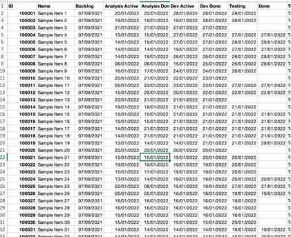
We have systems already in place to help us collect data, so let’s use them i.e. our visualisation / Kanban boards. Many of us use tools such as Jira which allow us to track the flow of work from idea to realisation, and more importantly allows us to capture data such as start and finish for each state of your work flow (see below table for example).
Collecting data helps teams to:
- Understanding our process – the flow of work from idea to realisation
- Make your process more efficient – reduce costs
- Improve your predictability – the distribution of completed work
- Be able to forecast – having optimised your processes and understood the distribution of work, you can now make a forecast
- Communicate with customers – having your data, you can define when the work may be delivered with a degree of predictability and communicate it to the client, knowing that it will be done in time.
The Met Office when forecasting the weather for tomorrow are right ‘six times out of seven’. How do they do this this? Why are they good at forecasting? They do this by making observations (lots of them) and collecting data from weather stations positioned around the country.
From there observations they get the data and run many simulations (experiments) to predict the weather for tomorrow. More importantly as they get more data, they continue to update the forecast and therefore make new predictions. While their predictions are not always correct, they are generally accurate.

So, can scrum teams take the same approach as the Met Office? Can we use the data we have to make better predication and with greater confidence?
We can, we just need to visualise the data we have at our hands
The visualisation of data helps teams identify areas for improvement and provides new actionable insight to drive value and to be more predictable. The chart below is a cycle-time scatterplot. Cycle time is the total elapsed time it takes a work item to travel from one point of your workflow (a start point) to another point (the finish point).
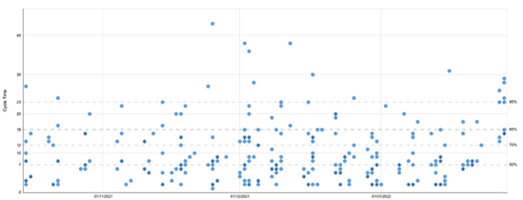
This cycle time scatterplot helps us see how predictable we are. More predictable teams see more condensed dot patterns than less predictable teams. The time axis lets us track our progress over time. The data above show that a work item can take as little as a few days to be completed and up to 43 days.
Looking at cycle time for a group of work items allows us to set an expectation as to how likely it is that we will finish future work in a given time range once started. Each dot represents the cycle time of a given work item.
Cycle time is a metric we can use to make forecasts for single items of work. Cycle time indicates how fast individual tasks on your Kanban board are being completed. Low cycle times mean that your team is performing well. By keeping performance high and cycle times down your team delivers results faster which means more happier customers and faster feedback loops.
Using the horizontal percentile lines, we can see that there is a 50% chance that any type of task will be completed within 7 days, and a 95% chance it will be completed within 23 days. The higher the percentile, the more likely that any assignment will be completed within that specific time frame.
So, if the customer says “we want a plan with a 95% confidence, how long will it take for this item to be complete? “. In this instance the answer is 23 days. So, the next item you hand over to us, when we start it will have a 95% chance of finishing 23 days or less. And that is our forecast.
This is the service level expectation i.e.; we now have an understanding of the customer tolerance to risk. So, we have two possible outcomes
1. Range i.e. 23 days or less
2. Probability i.e. 95%
The cycle time scatter plot chart is good but it only shows work that has been completed. The scrum team pull work from the sprint Backlog which will contribute to the done increment of work; however, work item execution does not always go to plan and the forecast of how long the work item will take may be inaccurate.
The Work Age Item chart (see below an example) is great at providing age information to the team on its experiments. Work Item Age is the elapsed time since the work item started. scrum teams need a signal if things are going wrong. This signal is going to come from an aging work in progress chart.
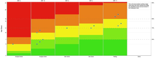
The chart shows the work flow stages at the bottom (x axis), which represents the columns on your visualization board. It also shows the age of an item, how long have we been worked upon (the y axis). The dots show the age of the item and where it is the workflow.
The chart also shows pace percentiles (the different colors) show where the risk is associated with certain items. Items in the green areas are what we expected and do not warrant further attention. The dots in the red areas represent a high risk. Each column shows the associated risk with past completion rates.
The cycle time data is great for answering “how long will it take” for a single work item. Work item age empowers the scrum team to make decisions when making its plan for the day. The purpose of the daily scrum is to inspect progress toward the sprint goal and adapt the sprint backlog as necessary, adjusting the upcoming planned work.
But, knowing the age of a work item isn’t enough information on its own. How do we know if the age of a work item is bad, good, or indifferent? To put age in context, the work age item chart is overlayed with percentile lines from the cycle timedata.
In the above chart, you can see that 85% of past items have finished in 16 days or less. You can keep that in mind as you track work items and make daily plans. If you want to maintain that level of predictability, you’ll need to continue to finish 85% of work items in 16 days or less.
Work item age is important to track for any team who wants to become more predictable. At its core, Work Item Age is a process improvement metric. When you see items aging more than expected, you can experiment with tactics to see if they help.
There is no single fix but common tactics include limiting WIP, controlling work item size, reducing dependencies, and more. The chart supports the Daily scrum, it improves communication, identifies impediments and promotes quick decision-making.
One good example of focusing on the right measures is the productivity of a team to deliver work. organisations create self-organising and empowered teams to deliver value in the shortest possible lead time. The metric most organisations measure is velocity, however this is not a good measure of team efficiency at all.
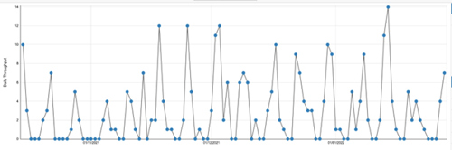
Throughput is the rate at which items complete a given process (within a specific time frame). In addition to knowing how long it takes to deliver customer value, a lot of agile practitioners are interested in how much work is being delivered for a certain period of time. Simply put, the throughput chart aims to visually represent your team's productivity in the past.
Looking at your Throughput allows us to analyse how consistently the Scum Team delivers value. Consistency of throughput, and how it compares to the rate at which you start work, is one indicator of how stable your process is.
Perhaps the most common use for the Throughput metric is to aid in providing forecasts for completing multiple work items. You can use cycle time to forecast for single items, but you need a rate metric like Throughput to provide forecasts for groups of work items.
The throughput run chart (see below) allows scrum teams to see patterns in its data and ask questions to learn more about how your team worked and why.
The scrum Guide states that the purpose of the sprint review event is to inspect the outcome of the sprint and determine future adaptations. The scrum team presents the results of their work to key stakeholders and progress toward the product goal is discussed.
It goes on to describe how along with stakeholders they review the accomplishment of the sprint and what has changed in their environments. During the sprint review new ideas emerge how to improve the product backlog in order to get closer to the product goal. Based on this information they collaborate on what to do next. Throughout is a great metric to support this conversation.
Those of you who are reading this article with a statistical background may have come across Monte Carlo simulation. This is a statistical model that uses the data in the Throughput run chart to simulate probable outcomes based on the variation found there. It’s a much more accurate, not to mention risk-aware, way to deliver forecasts. Monte Carlo simulations can help scrum teams to answer two questions:
- How many – provides forecasts for how many items you are likely to finish in a set period of time
- When – provides forecasts for when you are likely to finish a set number or range of items
During the retrospective, such flow metrics provide a valuable insight for the scrum team to help enable and plan for continuous improvement of how they work together regards to their process, tools or interactions. Flow metrics support process improvements to make work more predictable.
Conclusion
Metrics are a large part of predictability and determining success. Billy Beane from the Oakland A’s however recognised that for many years scouts had been asking the wrong question to understand the problem. How does a team with a limited budget compete with the big players in baseball?
He couldn’t compete in the bidding wars of picking players during the draft based upon the traditional toolkit of player selection. He needed to thinking differently, look at player data differently and reduce the risk of buying players who could not compete in the major league.
He determined that by looking at performance data differently, he would be able to buy players who may have been overlooked by his rivals. He concluded a better predictor of success was on-base percentage followed by slugging percentage.
I have illustrated how the flow metrics of cycle time; work item age and throughput can help scrum teams be more predictable and reduce the risk of failure. Having the data to take the right action at the right time for a scrum team is critical. If these signs are overlooked then the scrum team will not be able to answer the question “when will it be done!”