


Most of us would put good communication as one of the most critical elements of a successful change programme. We carefully craft our words with the intention of being positive, honest and inclusive; enticing everyone to join the journey to a destination that is new and different and of course better. But are words enough?
Text vs visuals
Rigid, hierarchical organisational structures of the past have been superseded by ever-evolving ecosystems. It is no longer enough to describe change in terms of the component parts of an organisation: change today needs to capture customer journeys and experiences, as well as the hearts and minds of the people impacted by change. It is almost impossible to represent complex, non-linear and dynamic entities succinctly using text alone, as text is linear and static.
Visualisations have been an important method of human communication for at least 35,000 years - from ancient paintings on cave walls and ceilings, to the symbols of Egyptian hieroglyphs and the pictograms of Chinese language characters. As our perception of the world is overwhelmingly visual, we should take advantage of the importance of visualisation when we communicate change. That doesn’t mean that visuals should replace words - change is fundamentally about people talking to each other, understanding each other and making sense of what’s going on.
I see what you mean
Much of what we visualise is in our minds, the ‘mental models’ that we build up based on our experiences and our biases. Even the language that we use suggests visuals are at play - “oh, I see what you mean”. If the visualisations (or models) that we create on the page can be used to collectively align the images that we have in our minds, we can have more meaningful conversations, better co-ordinate action and achieve more of what we set out to achieve.
If we want a visual to have the same meaning to a broad spectrum of people, then it needs to resemble the common experiences of people. Putting an abstract word in a box and using lines to connect it to other words in other boxes pre-supposes that everyone reads the same meaning into the words. By comparison, a more concrete visual that people can relate to from their own experiences is more likely to resonate - see the example of the two extremes in Figure 1.
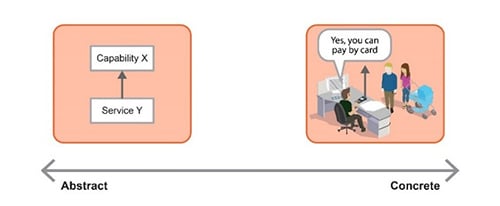
Figure 1. Abstract vs concrete visuals
A very technical model in a functional specification may be great for the team of specialists implementing it, but only because they’ve learned the modelling language in which it’s expressed and they’re familiar with the jargon used in it. However, its value outside of the group of specialists is limited, or open to broad interpretation.
The right visual for the job
So, what is the right visual? The short answer is: there isn’t one. There are many. But before considering the types of visuals, it is helpful to have a way of categorising them. If we take the degree of concreteness of the visual language shown in Figure 1 as one dimension and add to it a second dimension that represents the constraint of the visual language (the freedom that the creator of the visual has with the notation) then the result is a ‘visualisation continuum’ shown in Figure 2. This gives us a more meaningful way to compare the types of visualisations, the stakeholders that are associated with them and where they are produced in the change lifecycle.
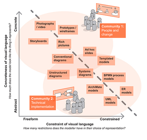
Figure 2. The visualisation continuum with example types of visuals
Superimposed onto the continuum is a sample of the types of visualisations, from freeform abstract photographs / videos through to the highly constrained abstract Unified Modeling Language (UML) models.
An interesting characteristic of the continuum is that there is a clear pull towards the diagonal axis from both the bottom-left and the top-right, which are empty. This is inevitable. The more concrete a representation, the less constraint is required because the meaning of the symbol is obvious. We do not need a formal grammar to tell us that a subject in a photograph or illustration is a person for example. But we do if an icon of a cylinder is a business role (as in the architecture modelling language ArchiMate) such as a salesperson.
Communities of change
Also superimposed onto the continuum in Figure 2 are two typical communities that exist on change programmes, namely: 1) the people and change community, who are trying to create shared meaning and motivation for change across a disparate group of stakeholders and 2) the technical implementation community who are trying to figure out in enough technical detail what the future state will look like, in order to bring it about.
In a programme context, the people and change community will tend to work with freeform presentation diagrams, metaphorical rich pictures, cartoon-like user journeys, videos, design-led prototypes and the like. Systems engineers will probably be using standards-driven modelling languages, either domain-specific or generic like UML, in order to ensure that the meaning is more tightly circumscribed.
Although the two communities use different types of visuals to communicate change, they are fundamentally talking about the same things. A pictorial vision that everyone can understand and buy into is useless if no one knows how to implement it. A model that perfectly expresses how to implement a change is useless if no one understands it. We need to find better ways of achieving both at the same time.
‘Visualisation works because pictures are closer to our experience of everyday life than words and the fastest way to create shared meaning is to create symbols that connect with shared experiences of what’s important to people.’
Crossing the community boundary
Surely there must be some merit in encouraging members of each of these communities to appreciate the work and outputs of the other and to pursue ways of integrating them. There are groups within each community trying to bridge the chasm (the design thinking practitioners in community 1 and the ArchiMate practitioners in community 2, for example) but there is much yet to be done.
An architectural model built using ArchiMate, for example, can connect the capability of an individual IT platform, through a series of associations (of other capabilities), to the top-level mission of the organisation. In theory, management should be poring over the model to understand the consequences and constraints of transformation decisions; the reason they don’t is not because it isn’t accurate or useful, but because they can’t read it!
To get better at change, we need to have more humility and more curiosity for those who see the world in different ways to us.