


We could make our source code beautiful with better type. Not type as in type system, but type as in typewriter. After all, when we read code, it tends to look like it came out of a typewriter.
The 1961 IBM Selectric typewriter had a choice of 45 typefaces, that you could select by changing its innovative golf ball type head. One of the typefaces that made up this wonderful variety was a new typeface that IBM had commissioned, called Courier. Did source code take advantage of this new technology? No, it did not.
While typewriter typography advanced, source code typography didn’t exist, to start with. Courier would later become important for source code, but before it became widespread, we printed COBOL on line printers. Line printers were designed to be fast, not for typography. In fact, from a typographical perspective, their output was primitive and ugly. This situation continued throughout the 1970s and 1980s.
X-head: First steps in source code typography
In 1992, Windows 3.1 introduced a new version of Courier called Courier New, which is still widely used for source code. Even though it was one of many in use, we now tend to think of Courier as a typewriter font. Microsoft commissioned Courier New as a Courier variant whose lighter font weight, with its thinner lines, would better suit low-resolution on-screen rendering.
Since the introduction of Courier New, source code typography innovation hasn’t been limited to new typefaces. The following code snippet illustrates the next innovations: syntax colour, bold, italic.
The code below shows an example of the next generation of typefaces: Consolas, which Microsoft introduced along with several other font families with an initial ‘C’ to take advantage of its new ClearType font rendering technology in 2004. Consolas’s improved legibility no doubt offered the most important benefit to programmers, but it also helps that it’s less ugly than Courier New.
More recently, source code can enjoy many new fonts designed for programming. This includes hipster commercial fonts like Pragmata Pro, as well as mainstream open-source fonts such as Inconsolata (a Consolas clone), Liberation Mono, Bitstream Vera Sans Mono, and more obscure new fonts such as Iosevka.
The story so far features a steady but relatively limited evaluation of new typefaces and basic styling. The most recent innovation in source code is as old as typography itself. As with software architectures, what’s old is new.
Two-dimensional layout
Today, software developers have, or should have, large widescreen monitors. When these developers work on large legacy code bases, they’re likely to end up looking at source code files that are ‘too long’ - hundreds or thousands of lines. Source code files are typically much taller than they are wide - a completely different shape to the monitor you read it on.
Modern monitors often have a 16:9 aspect ratio, while a 5,000 line class with 120 characters per line has an aspect ratio of about 1:8. The end result is integrated development environments with bento box user interfaces that only use a small portion of the available space for source code, and only show a small proportion of the code in that space.
Programmers would get more value from multiple large monitors if more of the monitor showed source code.
A fairly workable solution that uses the horizontal space is to flow the code into columns, and scroll sideways to view additional columns when the code still doesn’t fit on the screen. This approach risks making navigation harder, so we could make a number of additional improvements.
First, use a larger font size for method signatures, and maybe use horizontal and vertical lines to separate methods and columns. Next, add some top-level information in a masthead at the top of the ‘page’, and use a nice big font for the class name. Once you’ve got that far, you might as well go all the way, and use a classic broadsheet newspaper layout, with a coat of arms and drop caps.
If we actually did this, and used development environments that presented code in a multi-column newspaper layout, it would be a revolution in programming tooling. However, we’d have only caught up with seventeenth century print design. Two-dimensional layout with columns, separator lines and a masthead were already the norm for layout in the very first edition of The Oxford Gazette, the first newspaper to be published in England, on 7 November 1665. We’re going to need something more modern.
Modern layout and typography
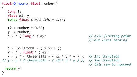
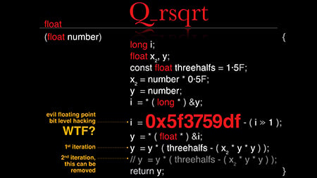
The Fast Inverse Square Root code is used to render 3D graphics in computer games such as Quake III Arena. This code would, therefore, benefit from a visual style that better fits the first-person shooter aesthetic.
Instead of just using syntax highlighting, bold and italics, we can use a number of techniques to improve the visual design. First, we can use multiple typefaces with a more modern look, and update the colour scheme.
For the layout, we can add a masthead for the function name, and a two-column layout with pull-out code comments. Finally, we can highlight the code’s surprising magic number, use non-ASCII characters, superscripts and subscripts, and generally tighten the kerning (letter-spacing).
The result is a more stylistically appropriate rendering of the code. The only thing it’s missing is a selection of game monsters.
This is a fun example (see below), but probably less appropriate for business applications. Enterprise software written in Java, say, needs something more corporate.
Corporate code style
Just as we used traditional newspaper layout and typography, and switched to computer game style, we can also switch to a modern corporate style that a company website or annual report might use. For this style, you can use stock photography, a sidebar for comments, and fewer colours.
Like the earlier computer game style example, this version commits another code typography heresy: no monospace fonts. We no longer need fixed-width typefaces now that we have high-resolution monitors. In high resolution, a proportional-width font is more legible, which is why newspapers use them. We may now be approaching the end of the age of the typewriter.
Posters and designers
While programmers were getting syntax highlighting and new fonts, during the last 35 years, desktop publishing has transformed access to digital layout and typography. Every social club newsletter and missing cat poster has experimented with designs that go beyond what we do with code. This, and 25 years of the web, have created an army of a new generation of designers, whose talents are largely wasted on marketing material.
Programmers spend far more time reading code than writing it, but development tools optimise for the writing, and do little to improve the code reading experience. Meanwhile, designers working for the marketing department spend days designing sophisticated product brochures and flyers that are discarded after only a few weeks or months. We maintain valuable code for years.
The future could potentially bring development environments that automatically style code with better typography and two-dimensional layout. However, we have a more immediate opportunity. Each system’s most interesting and valuable code deserves infographic-style design, and belongs on A0 posters hanging on the walls in the office, just as the marketing department celebrates previous campaigns.
Every development team should have a designer who does the layout and typography for the code. This layout and design should be creative and manual: an ongoing task to liberate code from bland typewriter-level presentation.
Only when we recognise and present the best code as art, will we be able to present it properly to future programmers. Galleries will exhibit signed prints, and would-be programmers will study coffee table books that show great software’s best code. In the end, perhaps legacy code will lose its negative connotation and gain the respect we give every other kind of legacy.